Artwork: MIAD Illustration (Negative)
|
World of Technology pt.2
Acrylic and Color Pencil on Illustration Board
(30.5 cm x 40.6cm)
November 2017
(30.5 cm x 40.6cm)
November 2017
Exhibition Text
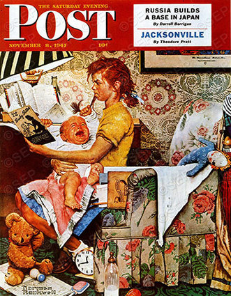
The illustration that I created was focused on technology and the way in which it contributes to our everyday life. My inspiration, Norman Rockwell, and his piece "The Babysitter" influenced the way in which I created my illustration as well as the use of space in the overall piece.
Process
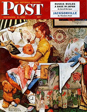
Because I had already decide on my theme for my illustrations, I decided to make the negative illustration similar to the positive one. With this illustration I plan to show how technology has affected us negatively.
Sketch #1
|
Sketch #2
|
Sketch #3 (chosen sketch)
|
Sketches
|
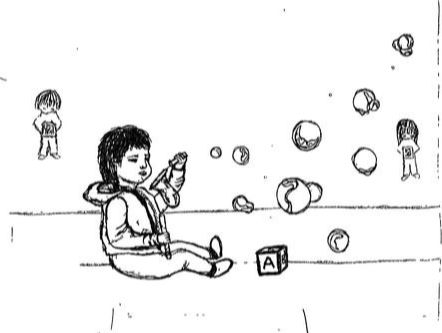
devices. The point of doing this is to show how technology has affected us in a way that is not wanted. Kids nowadays prefer playing in an electronic device than playing with the toys that they have.
- Sketch #2: The second sketch is meant to portray the way in which we have developed along with technology. What I plan to do with this sketch is draw the same kid as he grows up. First it will be his mom when she was pregnant and she will be texting in her phone. After that, the child will be born and will be constantly on electronic devices. This will show how we depend heavily on our devices and will show that it is hard for us to put the device down.
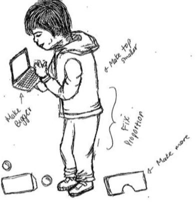
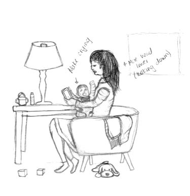
- Sketch #3: The final sketch that I made is a modern day babysitter. What I want to do with this piece is show the way in which technology has taken over. I will be showing a babysitter who is more interested in her electronic device and I plan to add a child in the floor who is also focused on his device. To make the piece look modern, I will add elements that can be seen in our current world.
Creating the illustration
|
|
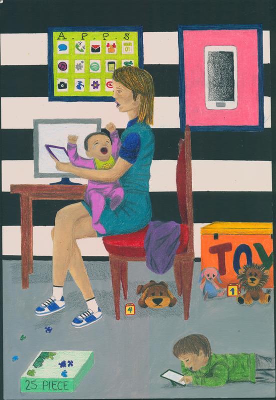
I began my illustration by referencing back to my inspirations piece. I looked at the position in which they are in and then had that guide me. I positioned the girl and the baby the same way. When doing this I thought about the easiest way to redraw the lady that was drawn in my first illustration. Because the easiest form for me is the carbon transfer method, I used that technique to redraw the lady in the same position. First I placed a blank sheet of paper on top of my first illustration and traced around the figure that I wanted as well as the chair in which she is sitting in. Then I colored the back of the sheet with my pencil. After the paper seemed to be colored enough, I took the sheet and taped it in the illustration board. By doing this I was able to keep the paper from moving. This was followed by tracing once again the outline that I had already created. Because this illustration is meant to show the negative aspects of technology I decided to draw an electronic device on the lady's hand and a baby crying in her other hand. Along with a small table and a few toys, I drew another child. Because he is older, he was drawn with a technological device while his toys, which can be seen behind him have sad faces. The outline of the overall piece is more simple since the place is focused on cellphones, apps, tablets, etc. Because of this I made the room look a bit more empty
|
Research
Before I began to think about coloring my piece I decided to do more research on techniques and looked at a variety of sources that could help me with adding color with color pencil. Some of the techniques that I learned involved the control and pressure when using color pencils. When you want something very light to be covered it is best to use a dull tip of a color pencil, in the other hand a sharp tip meant heavier coverage. Not only that but a sharp tip could also be used for details especially in smaller areas. As you add more pressure to the color pencil the darker and heavier the coverage will be. Not only did I get help with how pressure can affect the way in which my piece looks, but I also learned how to create texture with the use of color pencil. Long lines create a smooth surface as well as coloring lightly in circles. If you were to do many short straight lines, then a layered effect would be created. Another way to add value is by crosshatching. By doing this you can create a more even coverage and the amount of shadow will be more controlled. All of these suggestion worked great when trying out color pencil on my illustration. The last book that I resorted to was a comic book. Grayson by Tom King' Tim Seeley helped me when it came to finishing up my illustration. Because my illustration didn't look very realistic I decided to keep it that way and follow a style that was closer to caricatures and comic strips. The comic book that I referenced helped me when adding value, and gave me an idea of how to do different expressions.
Before I began to think about coloring my piece I decided to do more research on techniques and looked at a variety of sources that could help me with adding color with color pencil. Some of the techniques that I learned involved the control and pressure when using color pencils. When you want something very light to be covered it is best to use a dull tip of a color pencil, in the other hand a sharp tip meant heavier coverage. Not only that but a sharp tip could also be used for details especially in smaller areas. As you add more pressure to the color pencil the darker and heavier the coverage will be. Not only did I get help with how pressure can affect the way in which my piece looks, but I also learned how to create texture with the use of color pencil. Long lines create a smooth surface as well as coloring lightly in circles. If you were to do many short straight lines, then a layered effect would be created. Another way to add value is by crosshatching. By doing this you can create a more even coverage and the amount of shadow will be more controlled. All of these suggestion worked great when trying out color pencil on my illustration. The last book that I resorted to was a comic book. Grayson by Tom King' Tim Seeley helped me when it came to finishing up my illustration. Because my illustration didn't look very realistic I decided to keep it that way and follow a style that was closer to caricatures and comic strips. The comic book that I referenced helped me when adding value, and gave me an idea of how to do different expressions.
Adding Color
|
Experimentation
|
After I finished drawing my illustration I began to experiment with color. I decided to once again print out pages and use different techniques and methods on each page. I began by using watercolor, but I was very frustrated because I couldn't manage using that medium. My paper looked very light at the end and it all looked like if I made a wash on top. Because of this I decided to dedicate a page to only doing color pencil. The overall look was appealing to the eye, however there were parts that I was hesitant to add color to. The last page was made by using watercolor and color pencil. I used the watercolor as a wash and then used color pencil on top. By doing this I was able to fill out every small white spot that wasn't covered by color pencil.
|
|
Although I had already chosen what I wanted to do I ended up changing my idea once again. I decided to use acrylics and color pencils. I really like the way in which acrylics look when they are applied. They are very rich in color just like color pencil. I used acrylics on the walls and the skin. The walls were painted with a solid color while the skin had different shades. I made the skin tone by mixing red, green, yellow, and white. The paint was then split into three different sections. They were used to create different shades. One of the sections was left the same, then the other two had a different color added to them. Because one was going to act as a highlight, I added white, making the hue lighter. The last shade had a dark brown added so that it could work to add shadows. The last thing
|
|
that was painted with acrylics was the floor. The floor is a light gray which had no shades or highlights added. After that, I painted the rest with color pencil. It took me a while but I got the hang of it and began to use three or more colors for everything that was colored. As I colored I made sure that I always had a white, gray, and a black color pencil. When using lighter colors gray tones were used for shadow, but when a dark color was used black was the color chosen for value. To finish of my piece I used color pencil for small details.
Artistic Inspiration
|
Norman Rockwell was born in New York City during the year 1894. He was born a talented boy who later on used that gift to do something he liked. As he grew older he was enrolled in classes that helped him improve his skills. At age 14 he enrolled to his first art classes then later on dropped out of high school to study in an art academy. Because he was in love with the idea of creating art, he transferred to The Art Students League in where he prepared for his first commercial commission. By the time he turned 17 he had the opportunity of making his first illustration for the Saturday Evening Post. Because many were impressed with his illustrations, he was hired by the Saturday Evening Post.
His work of art was heartwarming or humorous illustrations that were meant to show what he viewed as the typical American life. Because of this he was both loved and criticized by many, but that did not stop him from making the art he wanted. Rockwell worked in the Saturday Evening Post as an illustrator for 47 years and created over 321 covers for the company. To commemorate Rockwell and his art, a museum was made in Stockbridge, Massachusetts in where you can see the great pieces of art that he made. |
The piece that Rockwell created is the way in which he viewed a babysitter. In my piece I want to add a similar pose to that of his illustration and also make it show a babysitter from nowadays. I plan to show the negative side by making her be more entertained with her electronic device. The baby will be crying like in Rockwell's piece and a second child will be added to fill out more space. In Rockwell's piece he used all of the space he had, and similarly I would like to use that technique.
Technology in our every day life
|
|
Another one of my inspiration was current events. When coming home from school I hear the same question being asked to my parents. My little brother always asks them "can I borrow your phone". As always my parents don't mind, and let him use their electronic device. When I think of todays world the same thing pops into my head. Technology is great, but it has taken over us. We now heavily depend on these electronics causing us to resort to them for entertainment or needs in general. Technological devices are like our safe zone when we don't want to face an unfamiliar situation or serve for our enjoyment. Nowadays children don't want to play outside or with their toys. The definition of having a good time has changed to using a technological device. In order to show this aspect as negative I
|
will have the babysitter paying more attention to her cellphone and have the baby crying. Another thing that I plan to add is another child also entertained in his electronic device. I will make it seem as if the entire place is dedicated to the use of electronic devices, just like I tend to see around me. My piece will show the way in which one might see a babysitter nowadays.
Reflection
|
The Babysitter by Norman Rockwell
Society, The Saturday Evening Post. “Classic Art: Growing Up with Rockwell.” The Saturday Evening Post, SATURDAY EVENING POST SOCIETY, 2017, www.saturdayeveningpost.com/2013/02/22/art-entertainment/norman-rockwell-art-entertainment/classic-art-rockwell-model-melinda-pelham-murphy.html.
|
World of Technology pt.2

Final Piece
|
At the end of this project, I was happy with my piece. I believe that the way in which it conveyed my theme was better than the previous illustration (positive). I believe that I was successful with the color palette that was chosen as well as the use of space. Although I didn't fill the entire board like Rockwell, I had a good reason for leaving a lot of space empty. The position in which the woman in Rockwell's piece is shown worked as inspiration when creating this piece. I used the same position as Rockwell. The lady in my piece was sitting in a very similar way. She had her legs crossed and was centered in the board. The position of the baby was also the same as Rockwell's. The baby has his hands up and is crying. By keeping the same position I was able to introduce the negative aspect without changing much. When compared to "The Babysitter" you can see the similarities of the position in which they were placed in. One of the differences is the fact that my piece looks more like a comic strip. Rockwell has a more realistic look to his piece which was what I originally wanted. I wanted to make an illustration that had that realistic look to it. Because I wasn't very successful I decided to leave my illustration that way. I left the piece alone and embraced it's look. Instead I resorted to comic books to see how shadows and highlights looked. Overall, I believe that I was successful with this piece because although there are many things that might have not come out how I wanted, I was able to create something that I personally liked and believed conveyed my theme the best.
Meaning
The purpose of my piece is to show how technology has taken over us. We are all greatly dependent on technology nowadays. In my piece I drew a lady with a baby on one hand and a technological device on the other. She is too busy on her device that she doesn't even notice that the baby his crying. On the floor the other child is kept busy and out of trouble with his tablet. I decided to draw them very focused on devices because that is what describes the world of today. Everywhere you go it can be seen that people resort to technological devices very often. Because of that reason I decided to make an illustration of something that revolves around that. To add more to this theme I decided to add picture frames in the background along with a table and computer. These are the things that relate to the theme that I chose. Along with this I added a box of toys. Only a few toys are outside of the box and they have sad faces because they are not being played with. This was drawn to add more to the fact that even children prefer to use an electronic for entertainment instead of playing outside or with their toys. At the end, my piece looked like it had lots of space around, it had en empty feeling. I kept the piece that way because I liked the lonely feeling that it created. Along with that the colors were also very similar. I kept colors that were dark in the background. The brighter colors that were used on the people were also kept because it draws the viewer to them, this then makes them look at what they are doing. By keeping the color palette this way others are able to tell with more ease the message that I am trying to send.
Connection to ACT
1. Clearly explain how you are able to identify the cause-effect relationships between your inspiration and its effect upon your artwork.
My inspiration affected the way in which my piece was positioned as well as the way in which I used color to add emphasis on certain parts.
2. What is the overall approach the author has regarding the topic of your inspiration?
The author of my inspiration wrote a biography on Norman Rockwell so that others can get a better understanding on why he drew certain illustrations as well as his influences on his creations.
3. What kind of generalizations and conclusions have you discovered about people, ideas, cultures, etc. while you researched your inspiration?
While researching I learned that not everybody agrees with your artwork. When Rockwell made humorous illustrations of what he described as the typical American life his work was controversial but that did not keep him form making art.
4. What was the central idea or theme around your inspirational research?
The central idea of Norman Rockwell was to show what he described as the typical American family in a heartwarming way, although at times humorous.
5. What kind of inferences did you make while reading your research?
After reading about Norman Rockwell I can say that he was never put down by the comments he received, which makes me inference that many artists have had to go by what they believe and not change their art to please others.
References
- Jeynes, Amy. Paint: Illustrated Techniques for Every Medium. North Light Books, 2007.
- Smith, Ray. An Introduction to Acrylics. Dorling Kindersley in Association with the Royal Academy of Arts, 1998.
- Seeley, Tim, et al. Grayson. DC Comics, 2016.
- Gherman, Beverly. Norman Rockwell: Storyteller with a Brush. Simon & Schuster, 2000.
- “Norman Rockwell - A brief biography - A career in illustration.” Norman Rockwell Museum, Norman Rockwell Museum, 2017, www.nrm.org/about/about-2/about-norman-rockwell/.
